So this week I was supposed to do the animations but I was still not pleased with the sprites and I was also told that the spy should not have a hat any more. This was decided because there was people that did not understand the hat or something like that. I heard that some thought that it looked like a bicycle helmet and that I can agree with that. The down bumps in the hat looked like the holes in a bicycle helmet. So I redid the head and when I did I realized that the shoulders were completely wrong. So I redid them and felt pleased with them, but when I came back to the sprite I saw that they was still wrong but in a different way so I redid it again. This time the shoulders were good but not the arms. So I asked people for help on how arms should look from above and I got some fast sketches to look at and explained to me how they should look. I even got pictures from my lead artist showing poses from above how it should look. All of this just ended up confusing me. I tried to do as I was explained to and how it really looks like from above and the arms were still a big problem. I have turned those arms around, making them bigger and smaller but it eventually looked like they were standing with their elbows bent and underarms pointing away from the body. Eventually I looked at another group in the class on their idle sprite and realized that it did not have arms showing, the way I thought in the start of the project. So I removed the arms fixed the shoulders some and started on animations. But I’m still not quite happy with the construction of the characters so I have asked for help from a teacher and hopefully I can get some help to see how it’s supposed to look.
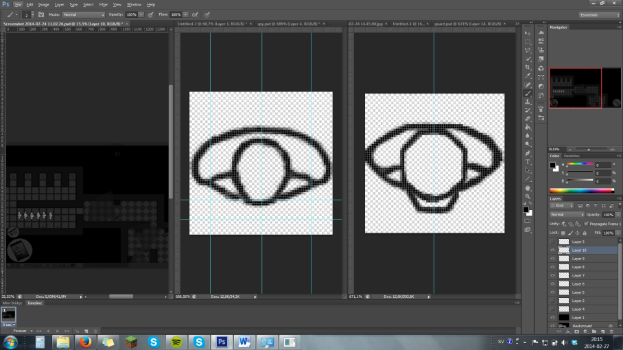
So this is how my computer has looked like for the past days but with different versions of the characters:
But instead of having both sprites I’ve had the reference photo. The first images from the left is a screen photo from our alpha game that I’ve made black and white and put one completely black layer with 82% opacity on so that it became darker since the game was a lot lighter that we was aiming for. This I did so that I could try how the colors would fit in etc.
The middle one is the spy, the character that the player is controlling. It is supposed to have 1940s male hair, but it looked messy though it was just some stripes so I have removed them for the moment to be able to focus on the rest. It is still not alright I see stuff now that I have to fix.
The same goes for the guard the last image. That one feels better though. I was aiming for it to have some edges so that it would feel different and we have learned that sharp edges makes us thing enemy and round edges makes us thing hero or at least “good guy”. And it kind of have that.

I think it’s really good that you’re analyzing what you’ve done and describing why and how you’ve changed the sprites… and looking at your Photoshop screenshot it feels like you have a good and clear base for the characters now. I like your idea with sharp vs. round edges (bad vs. good), and it sounds like a very good way to differentiate the characters from each other.
It’s great that you’ve asked around for feedback and help with the perspective issues too, and I hope that you won’t have to change that much more now so that you can just focus on the animation and other things instead of redoing your work.
I’ve faced the same top-down perspective problem since I’m responsible for the character and enemy sprites and their animation in my group, but I actually chose to “cheat” it out by tilting the characters a little. (The main reason that I tilted it was because I wanted to show some clothing details though.)
We did get some comments on it during the alpha though, saying that: “It looks like they all are walking over-confidently or bending backwards a lot while walking”, so I decided to change and make the sprites a bit closer to true top-down perspective after that…
Anyhow, I don’t think I have that much more to say. You talked a bit about an arm problem in the post, and I could kind of imagine how it may have looked like from how you described it, but it would have been nice to see a picture showing the problem. ; )
I’m not sure if I really should be one to talk since I’m not that great at posting progress pictures and stuff in my blog, but in cases like this it would be good to have a picture showing the problem to create the possibility and make it easier for your readers to help out and come up with ideas and solutions to the problem. : )
But except that, it was a good blog post.
I wish you good luck with the project, and keep the good work up!